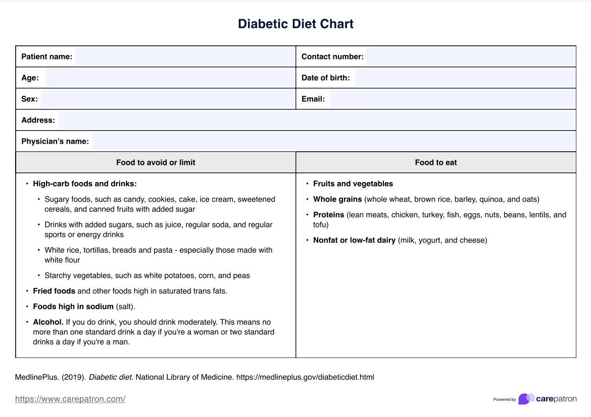
What is a Diabetes Chart?

A Diabetes Chart is an essential instrument in the toolkit of those managing diabetes. It offers a visual representation, enabling individuals, caregivers, and healthcare professionals to monitor and manage blood sugar levels with precision. The chart is structured to depict the entire spectrum of blood sugar levels, starting from the lowest and extending to the highest thresholds. Depending on the specific type of diabetes an individual has - whether it's Type 1, Type 2, or gestational diabetes - the chart can be tailored to reflect the unique nuances and requirements of each condition.

One of the standout features of the Diabetes Chart is its ability to provide a clear, chronological overview of blood sugar trends over a designated period, be it days, weeks, or months. This comprehensive view is invaluable as it allows for the identification of recurring patterns, potential anomalies, and periods of stability or volatility. Such insights empower patients and their healthcare providers to make informed decisions about treatment adjustments, dietary changes, and other lifestyle modifications.

Furthermore, when the Diabetes Chart is used with other diagnostic tools, such as the A1C test, it becomes a cornerstone in diabetes management. The combined data from both resources offers a holistic perspective on an individual's overall diabetes control, health trajectory, and areas needing closer attention or intervention. The Diabetes Chart is not just a tracking tool; it's a roadmap to better health for those with diabetes.

Downloadable Diabetes Chart PDF

Check out our free Diabetes Chart PDF to manage diabetes effectively

How does it work?

Here's a step-by-step breakdown of how the Diabetes Chart functions:

Step 1: Data Collection

Before using the chart, it's essential to have accurate blood sugar readings. These readings can be obtained multiple times a day, typically before and after meals, at bedtime, and sometimes during the night. The frequency of readings depends on the individual's type of diabetes and their treatment plan.

Step 2: Data Entry

Once the readings are collected, they can be manually entered into the chart. Alternatively, with technological advancements, many glucose monitoring devices can export data directly to digital charts, ensuring accuracy and convenience.

Step 3: Visualization

As data is entered, the chart plots these readings chronologically. This visual representation allows users to see their blood sugar fluctuations over days, weeks, or even months, providing a clear picture of their glucose control.

Step 4: Interpretation

The chart often features color-coded sections, making it easy to identify when blood sugar levels are within the normal range, slightly elevated, or critically high or low. These color codes serve as quick reference points for immediate understanding.

Step 5: Pattern Recognition

With regular updates, the chart can reveal patterns or trends in blood sugar levels. For instance, consistently high readings after a particular meal might indicate the need for dietary adjustments.

Step 6: Correlation with Events

One of the significant benefits of the Diabetes Chart is the ability to correlate blood sugar fluctuations with specific events. By annotating the chart with notes about meals, exercise routines, medication doses, or other significant events, users can gain insights into what might be causing spikes or drops in their blood sugar.

Step 7: Informed Decision Making

Armed with the visual data from our printable Diabetes Chart, individuals and their healthcare providers can make informed decisions about treatment modifications, dietary changes, and other necessary interventions to achieve optimal blood sugar control.

Diabetes Chart Example (sample)

Our Diabetes Chart PDF provides a visual representation of blood sugar levels at various intervals throughout the day. For instance, over a week, the chart might display readings taken before meals, post meals, and at bedtime. An initial reading of 90 mg/dL before breakfast that elevates to 140 mg/dL two hours post-meal indicates a typical food response. 

On the other hand, if the chart consistently showcases readings surpassing 180 mg/dL after meals, it may signal potential treatment modifications or closer monitoring. Such visual aids empower individuals to understand their blood sugar patterns better and make informed decisions about their health.

Check out our free Diabetes Chart PDF here

When would you use this Chart?

The Diabetes Chart is a versatile tool that plays a pivotal role in the comprehensive management of diabetes. Its utility spans various scenarios, making it indispensable for individuals with diabetes and healthcare professionals. Here's a detailed look at the situations where this chart proves invaluable:

Daily Monitoring

One of the primary uses of the Diabetes Chart is for the daily tracking of blood sugar levels. By consistently logging readings, individuals can stay informed about their glucose levels, ensuring they remain within the recommended range. This daily monitoring is crucial for preventing potential complications and ensuring optimal health.

Medical Consultations

During medical appointments, healthcare providers often review the Diabetes Chart to assess blood sugar control over time. The chart provides:

  • A visual representation.
  • Allowing for a quick yet comprehensive review.
  • Facilitating discussions about treatment efficacy and necessary adjustments.

Medication and Treatment Adjustments

For individuals on medications or insulin therapy, the chart serves as a reference point for adjusting doses. By correlating blood sugar readings with medication doses, healthcare providers can fine-tune treatment plans to achieve better glucose control.

Lifestyle Impact Analysis

The Diabetes Chart is instrumental in understanding how lifestyle choices, such as diet and physical activity, impact blood sugar levels. By reviewing the chart, individuals can identify which foods or activities lead to spikes or drops in their glucose levels, empowering them to make informed choices.

Education and Awareness

For those newly diagnosed with diabetes, the chart serves as an educational tool. It visually represents the importance of blood sugar control, helping individuals grasp the nuances of diabetes management. Healthcare professionals often use the chart as a teaching aid during diabetes education sessions, illustrating the effects of various interventions on blood sugar levels.

The Diabetes Chart is not just a tracking tool but a comprehensive resource that aids decision-making, education, and proactive diabetes management.

What do the results mean?

Our free Diabetes Charts provide a visual representation of blood sugar levels over time, offering insights into the effectiveness of diabetes management strategies. Interpreting the results correctly is crucial for making informed decisions about care and treatment. Here's a breakdown of what the results typically indicate:

Target Range Consistency

If most readings on the Diabetes Chart fall within the target range set by healthcare professionals, it suggests that the current diabetes management plan is effective. Consistent readings within this range indicate that the individual maintains blood sugar levels close to non-diabetic values, reducing the risk of potential complications.

Frequent High Readings

Multiple readings above the target range can be a cause for concern. Elevated blood sugar levels, if persistent, can lead to long-term complications such as nerve damage, kidney issues, and cardiovascular problems. High readings might indicate challenges like inadequate medication dosing, dietary choices that aren't optimal, or other underlying medical conditions.

Regular Low Readings

Conversely, frequent readings below the target range can indicate episodes of hypoglycemia, which can be dangerous if not addressed promptly. Low blood sugar levels might result from excessive medication doses, skipped meals, or intense physical activity without adequate carbohydrate intake.

Patterns and Trends

Beyond individual readings, the Diabetes Chart can also reveal patterns. For instance, consistently high readings after meals might suggest the need for dietary adjustments, while regular low readings at night could indicate the need to modify evening medication doses.

While our free Diabetes Chart is a valuable tool, it's essential to remember that it provides a part of the overall picture. Regular consultations with a healthcare provider are crucial. They can interpret the chart in the context of other health factors, ensuring that the diabetes management plan remains tailored to the individual's unique needs.

Why use Carepatron as your Diabetes app?

Diabetes management requires precision, consistency, and a holistic approach. Carepatron, with its state-of-the-art Diabetes Chart app and Diabetes Chart Software, offers a seamless experience tailored for diabetes care. Here's why Carepatron stands out:

User-Centric Design

Carepatron's platform is intuitively designed, allowing users to input, track, and analyze blood sugar readings effortlessly. This ensures that individuals can focus on their health rather than navigating complex software.

Collaborative Care

With features that promote real-time collaboration, healthcare professionals, patients, and caregivers can work together, ensuring comprehensive diabetes management.

Unparalleled Security

Carepatron is globally compliant, adhering to stringent security standards like HIPAA and GDPR. Users can be assured that their sensitive health data is in safe hands.

Versatile Offerings

Beyond diabetes, Carepatron offers solutions for various healthcare needs, from chiropractic software to psychiatry practice management, making it a one-stop solution for health practitioners.

Global Trust

Carepatron's commitment to delivering beautiful experiences is evident in its global user base, making it a trusted worldwide platform.

For those seeking a reliable, efficient, and comprehensive platform for diabetes management, Carepatron is more than just software; it's a commitment to enhancing healthcare experiences. With its simple practice management solution, Carepatron is revolutionizing how healthcare is managed and delivered.

EHR software benefit

References

Smith, J. A., & Jones, M. P. (1995). Journal of Diabetes Care, 18(2).

Brown, L. S., & Miller, W. R. (2002). Diabetes Research and Clinical Practice, 56(3).

Johnson, P. R., & Graham, T. L. (2015). Journal of Patient-Centered Care, 3(1).

Roberts, C. J., & Campbell, I. K. (2010). Endocrinology Today, 29(4).

Who typically requests a Diabetes Chart?

Commonly asked questions

Who typically requests a Diabetes Chart?

Individuals with diabetes, caregivers, and healthcare professionals are common users of the Diabetes Chart.

When are Diabetes Charts used?

Diabetes Charts can be used for daily tracking, during medical appointments, or when making treatment adjustments.

How are Diabetes Charts used?

To input and visualize blood sugar readings, identify patterns, and make informed decisions about diabetes care.

How long does a Diabetes Chart take?

The time varies based on the frequency of readings and the duration over which the Diabetes Chart is maintained.

Join 10,000+ teams using Carepatron to be more productive

One app for all your healthcare work