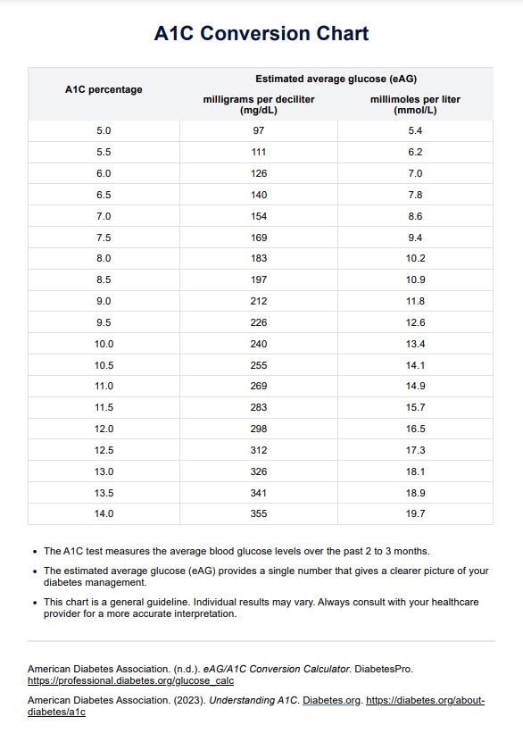
What is an A1C Conversion Chart?

The A1C Conversion Chart is designed to bridge the gap between intricate medical data and the everyday understanding of blood sugar management. At its core, this chart translates the results of the A1C blood test, which measures the percentage of hemoglobin in the glycated blood (coated with sugar), into estimated average glucose (eAG) readings. This conversion is pivotal for several reasons.

Firstly, the A1C test is a cornerstone in diabetes management. It provides a comprehensive overview of an individual's blood sugar levels over an extended period, typically 2-3 months. While this test is incredibly valuable for healthcare professionals to gauge the effectiveness of treatments and interventions, the results, often presented as a percentage, can be abstract for patients.

This is where the A1C Conversion Chart shines. Converting these A1C percentages into daily blood sugar averages offers a more tangible and relatable insight into one's health. For someone managing diabetes, understanding these numbers can be the difference between feeling overwhelmed and feeling empowered.

Moreover, the chart plays a pivotal role in patient-doctor communication. With a clearer, more relatable metric, healthcare providers can more effectively discuss treatment plans, potential lifestyle adjustments, and overall diabetes management strategies with their patients. This fosters a collaborative approach where patients are more informed and can actively participate in decisions regarding their health.

The A1C Conversion Chart is more than just a tool for translation; it's a catalyst for better diabetes management, promoting understanding, communication, and proactive care.

Printable A1C Conversion Chart

Download this A1C Conversion Chart to assess an individual's blood sugar levels.

How does it work?

The A1C Conversion Chart is a meticulously designed tool that bridges the A1C test results with the estimated average glucose (eAG) levels, making it easier for individuals and healthcare professionals to interpret and act upon the data. The chart's foundation lies in extensive research that has found consistent relationships between A1C percentages and average blood glucose levels over 2-3 months.

  1. Gather A1C Results: Obtain the A1C test result, typically provided as a percentage, from a certified laboratory report or your healthcare provider.
  2. Navigate the Chart: On the A1C Conversion Chart, locate the specific A1C percentage you've received.
  3. Determine eAG Value: Directly corresponding to the A1C percentage, you'll find the eAG value. This value, presented in either mg/dL or mmol/L, represents the estimated average blood glucose level over the past few months.
  4. Interpret the eAG: The eAG value provides a clearer picture of daily blood sugar averages. It's akin to regular glucose meter check readings, offering a more tangible insight into blood sugar management.
  5. Consultation: While the chart provides valuable data, consulting with a healthcare provider is essential to interpret the results thoroughly. They can provide context, recommend potential adjustments to diabetes management strategies, and answer any questions.
  6. Regular Monitoring: It's beneficial to regularly use the A1C Conversion Chart, especially after subsequent A1C tests, to track changes and ensure optimal diabetes management.

By simplifying the connection between A1C percentages and daily blood sugar averages, our Printable A1C Conversion Chart empowers individuals with diabetes to take proactive steps in their health journey, fostering better understanding and managing the condition.

A1C Conversion Chart Example (sample)

The A1C Conversion Chart is a visual representation to seamlessly translate A1C percentages into estimated average glucose (eAG) levels. Let's delve into a practical example to understand its application:

Imagine an individual undergoing an A1C test, and the result comes back as 7%. By referring to the A1C Conversion Chart, this 7% corresponds to an eAG of approximately 154 mg/dL. This indicates that the person's average blood glucose level hovered around 154 mg/dL over the preceding 2-3 months. Such insights are invaluable as they provide a consolidated view of blood sugar management, eliminating the need to decipher daily glucose meter readings.

This example underscores the chart's utility in offering a comprehensive snapshot of one's blood sugar control, aiding patients and healthcare providers in making informed decisions about diabetes management. For a more detailed breakdown and other A1C percentages, you can refer to our comprehensive A1C Conversion Chart PDF.

Download this A1C Conversion Chart Example: 

When would you use this Chart?

The A1C Conversion Chart bridges the gap between complex laboratory results and actionable insights for patients and healthcare providers. Here are the primary scenarios where the chart proves invaluable:

  1. Routine Medical Check-ups: Healthcare providers often review A1C lab results during regular medical appointments. The chart aids in translating these results into understandable terms, allowing for a more comprehensive discussion about blood sugar management.
  2. Goal Setting: For individuals with diabetes, maintaining optimal blood sugar levels is crucial. The chart assists in setting tangible blood sugar targets, ensuring that both short-term and long-term goals align with overall health objectives.
  3. Treatment Evaluation: Diabetes management often involves a combination of medications, dietary changes, and lifestyle adjustments. By comparing successive A1C results and their corresponding eAG values, healthcare providers can gauge the effectiveness of ongoing treatments and make necessary modifications.
  4. Patient Education: For patients, understanding diabetes can be overwhelming. The A1C Conversion Chart demystifies the relationship between daily blood glucose readings and long-term glycemic control, empowering patients to take proactive steps in their health journey.
  5. Decision-making Tool: The chart serves as a reference point when contemplating changes in medication dosages, introducing new treatments, or making significant lifestyle alterations. It provides a clear picture of how past decisions have impacted blood sugar levels, guiding future choices.

The A1C Conversion Chart is a tool and a compass, guiding individuals with diabetes and their healthcare teams toward optimal health outcomes. 

What do the results mean?

The A1C test and the A1C Conversion Chart are a cornerstone in diabetes management. It provides a snapshot of blood sugar control over the past 2-3 months. When A1C results are converted to eAG using the chart, they become more tangible, mirroring the numbers on daily glucose monitors.

Understanding eAG

The estimated Average Glucose (eAG) is a measure that reflects the average blood sugar levels over a period. It's expressed in the same units (mg/dL or mmol/L) as daily blood glucose monitoring, making it more relatable for individuals with diabetes.

Interpreting the Numbers

  • Lower eAG Values: A lower eAG suggests that blood sugar levels have been closer to the target range set by healthcare providers. This indicates effective diabetes management and reduces the risk of long-term complications such as neuropathy, retinopathy, and cardiovascular diseases.
  • Higher eAG Values: Elevated eAG values indicate that blood sugar levels have been higher than desired over the past few months. This might signal the need to re-evaluate the current treatment plan, dietary habits, or medication dosages.

Risk Assessment

Consistently high eAG values can be a precursor to potential diabetes-related complications. It's crucial to understand that while occasional spikes in blood sugar might not be immediately harmful, sustained elevated levels can harm various organs and systems.

Guiding Treatment

The conversion chart helps in understanding past blood sugar control and forecasting future health outcomes. Regularly comparing eAG values over time can guide adjustments in treatment, ensuring that individuals with diabetes get the best possible care tailored to their needs.

The A1C Conversion Chart acts as a bridge, translating laboratory A1C results into actionable insights. It's a tool that demystifies complex numbers, making diabetes management more transparent and effective. For a comprehensive understanding of your A1C results and their implications, refer to our Free A1C Conversion Chart.

Why use Carepatron as your A1C Conversion app?

Carepatron is a beacon of efficiency and user-centric design in digital healthcare solutions. Regarding A1C conversion, a process integral to diabetes management, the platform's features make it an invaluable asset. Here's why:

User-Friendly Interface

Carepatron's design philosophy prioritizes the user. The platform's intuitive layout ensures that converting A1C results to eAG values is a breeze, even for those less tech-savvy.

Data Security

 In today's digital age, data privacy is paramount. Carepatron is committed to safeguarding user data and adhering to stringent global security standards like HIPAA, GDPR, and HITRUST.

Collaborative Features

Carepatron's real-time collaboration tools allow healthcare teams to work cohesively. Whether sharing A1C results or discussing treatment plans, the platform facilitates seamless communication akin to in-person interactions.

Global Reach

With a diverse user base spanning continents, Carepatron is a trusted name worldwide. Its commitment to delivering exceptional user experiences is evident in its widespread acclaim.

Integrated Tools

Beyond A1C conversion, Carepatron offers a suite of tools tailored for healthcare professionals. From patient portal software and healthcare payment software to medical dictation software and clinical documentation software, it's a holistic solution for modern healthcare needs.

Education and Training

While Carepatron is designed to be intuitive, it also offers resources and support to ensure users can maximize the platform's potential. This commitment to user education underscores its role as a partner in healthcare, not just a tool.

For those seeking a digital solution for A1C conversion and broader healthcare management needs, Carepatron emerges as the obvious choice. Its blend of user-centric design, robust security, and comprehensive features make it the gold standard in digital healthcare platforms.

Practice Management Software

References

  1. American Diabetes Association. (2020). Standards of medical care in diabetes—2020. Diabetes Care, 43(Supplement 1), S14-S31.
  2. Nathan, D. M., Kuenen, J., Borg, R., Zheng, H., Schoenfeld, D., & Heine, R. J. (2008). Translating the A1C assay into estimated average glucose values. Diabetes Care, 31(8), 1473-1478.
  3. The Diabetes Control and Complications Trial Research Group. (1993). The effect of intensive treatment of diabetes on the development and progression of long-term complications in insulin-dependent diabetes mellitus. The New England Journal of Medicine, 329(14), 977-986.
Who typically requests an A1C Conversion Chart?

Commonly asked questions

Who typically requests an A1C Conversion Chart?

Healthcare providers, diabetes educators, and individuals can use the A1C Conversion Chart.

How are A1C Conversion Charts used?

To translate A1C percentages into average blood sugar readings.

How long does an A1C Conversion Chart take?

The A1C Conversion Chart is a quick reference tool, so it's almost instantaneous once you have the A1C result.

Join 10,000+ teams using Carepatron to be more productive

One app for all your healthcare work